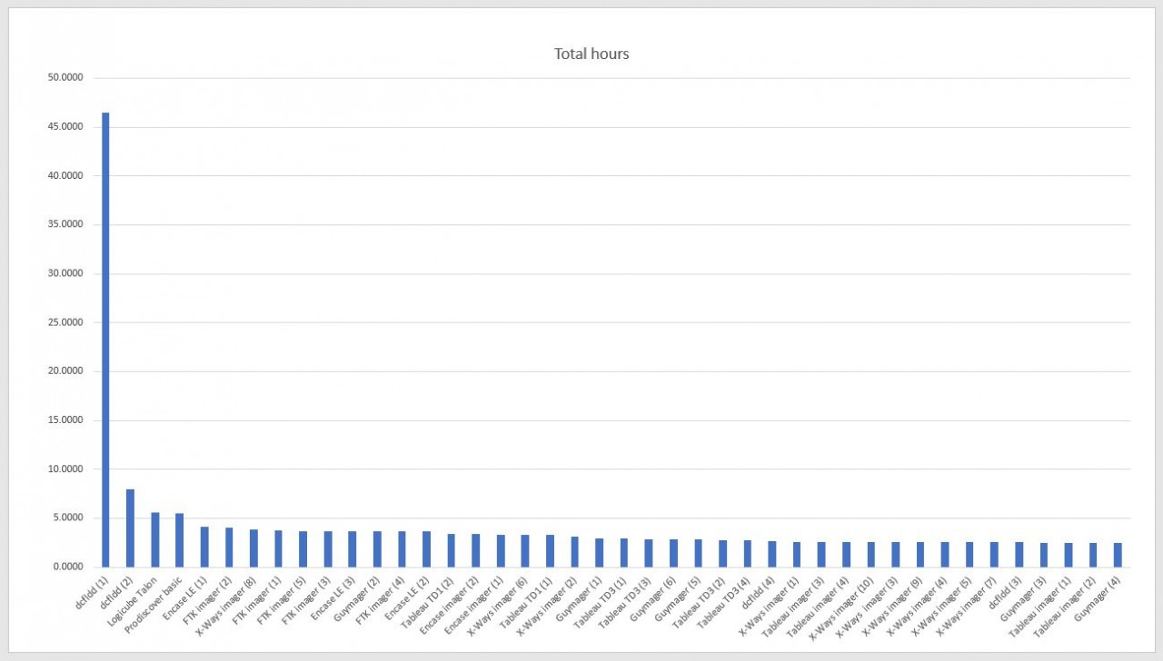
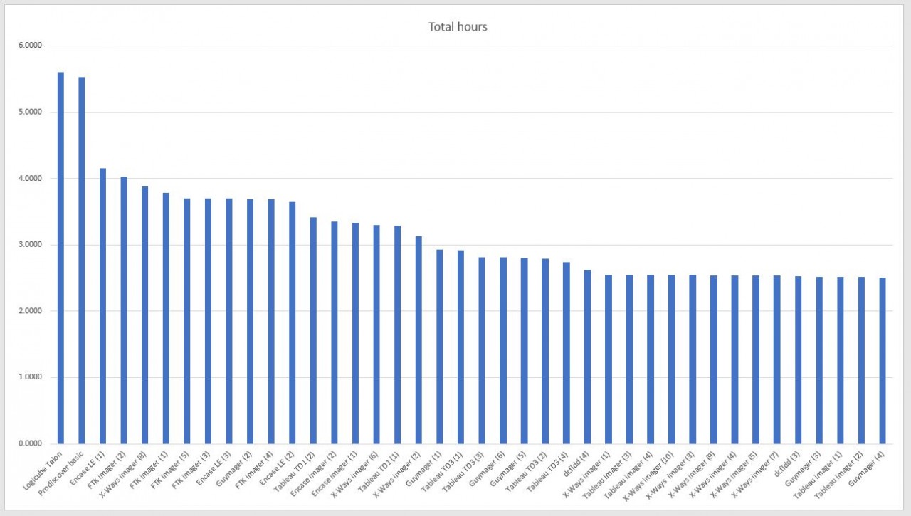
In my most recent course that I was teaching, the question of imaging speed came up during the hands-on imaging practicals (it's always the same question, "How can I make it go faster?"). My go-to illustration of imaging tests has been referring to Eric Zimmerman's imaging tests. However, I tried something different this time. I used Eric's tests (both imaging and software testing) and converted the spreadsheet data as visuals. The visuals made all the difference, especially given mixed language in the course (as the course was not just in English…so it was a bit more difficult to get points across at times).
With the visuals, it was easier for the class to see that some speed differences in the tests are slight enough to be irrelevant (in that personal preference of a tool may override the speed of another tool without detriment), while other speed differences are glaringly too far apart to rationalize a personal choice over a more logical choice when speed is important. I ended up adding a separate lesson in doing personal testing, documenting the tests in the fashion of Eric Zimmerman's, and using the results to base decisions upon. Nearly every slide had the same suggestion: "SHARE YOUR WORK'. By sharing, I mean giving it away or selling it or teaching it or sharing it in any means you desire for fun or profit. Just get your work out there.
Eric set a standard in documenting imaging speed tests, but he also did something else; he showed that documenting and sharing tests results impacts the community globally for years as it is referenced constantly. His test also shows that this is something any of us can also do. If you think that your work is but a sliver in what can or should be done in sharing, keep in mind that a sliver to you is most likely an amazing bit of knowledge for someone else. And by sharing, I mean publish, teach, show, or compare your work with others. Most of the innovative developments in history have been inspired by a sliver of an idea.
The fear that your public work will be critiqued is real, not just because it will be, but because it must be. Public peer-reviews require thick skin and a willingness to accept being wrong, and how to improve our work. It also shows that you have the guts to put yourself out front, which any job in DFIR requires anyway. Do it and be prepared to learn from your peers when your work is peer reviewed. That is your goal: peer reviewed research that you personally conducted. As a side benefit of sharing your work, software developers will certainly look at what you have documented to see where their tool stands. Regardless of their tool is on the top or bottom, the tests show how developers can improve their tools, which benefits you (and me) directly.
About the critiques of your shared research….in a perfect world, everyone plays nice, is polite to each other, and we support the work of our peers with respectful and productive discussion. But don’t expect that every time, and accept that some folks just aren’t nice. Actually, be prepared for someone to be dismissive, impolite, and even downright disrespectful. It happens because people are people. My personal opinion is that everyone should be respectful or not say anything at all. However, “polite” is not a word in the vocabulary of some. Still, don’t let that stop you moving DFIR forward with your shared work and ideas. Each of us have a choice to follow the path that others have blazed or we can blaze a trail that others will follow. Blazing a trail sometimes means going the wrong way or hitting a dead end...you will be wrong on occasion.
Back to the point of visuals in training: Here one example of turning Eric’s work into visual aids. The takeaway in these visuals is not that a visual is ‘better’ than a spreadsheet, but that it is (1) different, and maybe (2) more appropriate for specific audience types. The imaging example is just an example of practically anything in DFIR that can be more easily described in a visual compared to rows and columns, depending upon your goal of showing data.
I will post my slidedeck at some point, but I hope you got the point of taking complex data and painting a picture with it to make it easier to digest.
Article Link: http://www.brettshavers.cc/index.php/brettsblog/entry/make-dfir-easy-to-learn-with-visual-aids